
The Magic of Colours: Create the Perfect Football Kit with MOMUTO
In the world of football, the kit is more than just a piece of clothing. It's a symbol, a rallying cry, an identity. With MOMUTO, capture that magic. But how, exactly?
The Power of Colours
Colours speak. They tell stories. They radiate energy, passion, or even calm. Spain shines in red; Argentina dances in blue and white. And let's not forget les Bleus! The France national team's away kit for the 2022 World Cup was more than just blue, white and red. It represented the diversity and rich heritage of France — from the iconic cockerel and the Arc de Triomphe to the Flower of Tahiti. Details that celebrate France in all its splendour.
Legends and Their Colours
- Liverpool: Red and white. The passion, the energy, and the soul of a port city.
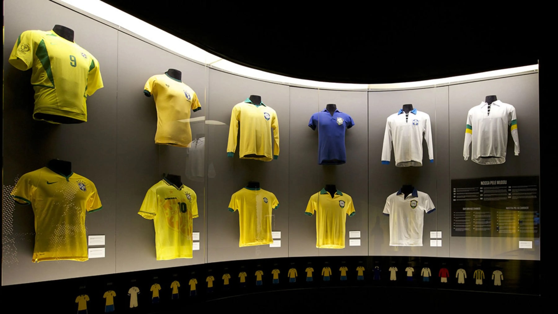
- Brazil: Their switch from white to yellow was about more than aesthetics. Following a World Cup heartbreak, that vivid yellow — nicknamed "canarinho" — symbolised rebirth. Joy rediscovered.
- Jamaica: Green, yellow, black. The colours of the flag, the pride of a nation.
Two Histories Behind Every Shirt Colour
Football colours carry two histories at once. The first is club identity: the colours supporters recognise and expect, like Liverpool red or Barça's blue and garnet. The second is kit fashion: how designers reinterpret those colours every season, especially on away and third shirts.
That is why "red" is rarely just red. A club can stay true to its identity while the shade slides from scarlet to crimson, or while designers add a second and third tone for depth.
A Football Colour Vocabulary
Use these as starting points when you talk about colour with your team. They are practical digital approximations, not official club or manufacturer specifications: real fabric colour depends on the dye, the material, the lighting and your screen.
| Colour | Approx. HEX | Typical feel |
|---|---|---|
| Scarlet / vivid red | #D71920 | Bright, classic, high energy |
| Deep crimson | #A6192E | Richer, more traditional |
| Liverpool-style red | #C8102E | Strong, clear club red |
| Arsenal-style red | #EF0107 | Brighter, punchier red |
| Garnet / burgundy | #6A1B2D | Heritage, restrained |
| Royal blue | #0033A0 | Strong, saturated blue |
| Navy | #0B1F3A | Traditional, premium, versatile |
| Sky blue | #6CABDD | Light, open, instantly recognisable |
| Teal / turquoise | #00A6A6 | Modern, energetic, less traditional |
| Mint | #A8DCC7 | Retro, fresh, fashion-led |
| Acid / neon yellow | #D7F000 | High visibility, very contemporary |
| Off-white / cream | #F1E9D2 | Softer, vintage, lifestyle |
| Gold | #C8A24A | Heritage, prestige, celebration |
| Black | #111111 | Strong contrast, fashion, goalkeeper favourite |
What the Big Brands Are Doing
There is no single "Nike red" or "adidas blue". Shades change with the team, the season and the product. What you can read in the recent launches is an approach:
- Nike, national teams 2024: Nike built the range around what it called a "metaprism" approach, refreshing each federation's traditional colours through light and movement. South Korea's home kit added pink tones to its red; France's away kit turned the tricolore into a gradient of stripes.
- adidas, Bayern Munich 2024/25: the first home shirt in the club's history to use three shades of red, with darker stripes fading into a halftone pattern of diamonds borrowed from the crest and the Bavarian flag.
- Nike, Barcelona 2025/26: the blaugrana stripes returned with a gradient that blends the blue and the garnet.
The common thread: protect the identity colours, then play with depth, tone and texture.
How Kit Colours Have Moved
It is not a straight line towards "more colour". Kits swing between experimentation and restraint.
- 1980s: the replica boom and shirt sponsorship brought pinstripes, jacquard shadow stripes and woven patterns. The 1990s then split opinion, with plenty of critics finding the shirts over-elaborate.
- 2018: Nigeria's lime green and black World Cup shirt is often seen as the moment fans accepted a really loud pattern, with reports of around three million pre-orders.
- Early 2020s: retro references and fashion influence grew, and away and third shirts became far readier to leave a club's usual palette.
- 2025/26: kit-trend coverage points to off-white and cream bases (Arsenal's third, Napoli's away, Ajax's third), embossed tonal patterns, the return of piping, and turquoise accents such as Brighton's kit and Wolves' away shirt.
So the direction is not simply "more neon" or "more minimal". Home shirts mostly protect identity, while away and third shirts make room for cream, mint, turquoise, pink, purple and fashion-led combinations, often with quieter surface treatment such as tonal texture instead of a high-contrast graphic.
What We See in the Kits Teams Design With Us
Looking at the kits our teams create, three habits stand out:
- Goalkeepers get the boldest colours. Over the last two to three years we have seen neon shades and black-and-gold combinations rise steadily in the keeper kits designed with us.
- Names come from places, and colours follow. Many teams take their name from a hometown or a district and borrow colours from that place's flag.
- Some teams play with the name. Schalke Temeto winks in Spanish at Schalke 04 and keeps the blue-and-white identity of the original. Inter de Mami does the same with Inter Miami, twisting the name and playing with its colours.
These habits shaped the range of colours we offer in the 3D designer: a team that wants its hometown flag, a keeper kit in neon, or a playful twist on a famous palette should not hit a wall.
How to Find Your Perfect Colour Combination?
Contrast. Complementarity. Symbolism. Integration. Four keywords.
- Contrast: Your colours must stand out. Being visible is vital.
- Complementarity: Colours that enhance one another. Think red and green.
- Symbolism: Your team's history, its culture — all of it can be a source of inspiration.
- Integration: Follow the lead of the world's top teams. They opt for harmony where the brand logo, team badge and sponsor all share a colour palette. Everything comes together seamlessly, creating a balanced design where nothing feels out of place.
A Reliable Formula
- Choose one unmistakable main colour.
- Use a second shade of that colour for depth: two reds, two blues, or a tonal green.
- Keep contrast details to one or two colours.
- Put the big colour experiment in the away or third shirt.
- If the pattern is busy, keep a clean area around the crest, the sponsor and the number.
For example, a contemporary red home kit could use #C8102E for the body, #8E1028 for a subtle tonal pattern, and cream #F1E9D2 or navy #0B1F3A for the trim. It reads as football and heritage, and still feels current.
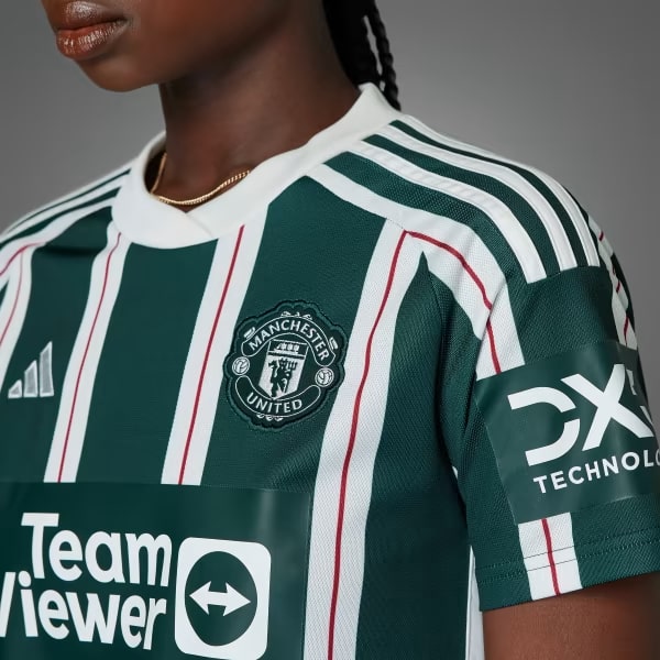
MOMUTO: Your Colours, Your Kit
Discover over 30 ready-to-use templates at MOMUTO, each featuring vibrant colours that capture attention. But the real magic? You're in charge. Every element can be customised in colour, allowing you to faithfully express your team's identity. Make it yours. Personalise every detail. Colours, printing, logo, patterns. Everything. If you need help using our 3D configurator, check out our step-by-step guide.
Get Started!
The world is waiting to see your masterpiece. With MOMUTO, turn your vision into reality. Begin your colourful journey right now by following our 3D configuration tutorial.
For exclusive updates and to connect with us and fellow fans, join our community. Follow us on Twitter and Instagram!
Read next: the complete guide to custom team kits · kits for a grassroots club.